Copyright (c) Hyperion Entertainment and contributors.
UI Style Guide Menus: Difference between revisions
Steven Solie (talk | contribs) No edit summary |
m Removed extra linefeed |
||
| (7 intermediate revisions by 3 users not shown) | |||
| Line 1: | Line 1: | ||
[[Category:User Interface Style Guide]] |
|||
== Menus == |
== Menus == |
||
| Line 17: | Line 18: | ||
The menu system consists of the menu bar which shows the name of each menu, a drop-down menu under each name showing the list of choices (also known as menu items), and an optional group of secondary choices called a submenu, which are attached to a menu item. Submenus should appear to the right of the menu. |
The menu system consists of the menu bar which shows the name of each menu, a drop-down menu under each name showing the list of choices (also known as menu items), and an optional group of secondary choices called a submenu, which are attached to a menu item. Submenus should appear to the right of the menu. |
||
[[File:SG6-1.png|frame|center| |
[[File:SG6-1.png|frame|center|Elements of the menu system]] |
||
== General Rules == |
== General Rules == |
||
| Line 45: | Line 46: | ||
=== Colors === |
=== Colors === |
||
When possible, menus should use dark text on a light background |
When possible, menus should use dark text on a light background. |
||
=== Font === |
=== Font === |
||
| Line 57: | Line 58: | ||
Toggle items should be indented to allow room for the check mark. This will give the user a visual cue that it is a toggle item. |
Toggle items should be indented to allow room for the check mark. This will give the user a visual cue that it is a toggle item. |
||
[[File:SG6-2.png|frame|center| |
[[File:SG6-2.png|frame|center|A toggle menu item shown in both states]] |
||
=== Organization === |
=== Organization === |
||
| Line 92: | Line 93: | ||
Whenever a menu or menu item is inappropriate or unavailable for selection, it should be ghosted. Never allow the user to select something that does nothing in response. |
Whenever a menu or menu item is inappropriate or unavailable for selection, it should be ghosted. Never allow the user to select something that does nothing in response. |
||
[[File:SG6-3.png|frame|center| |
[[File:SG6-3.png|frame|center|A menu with ghosted items]] |
||
=== Labeling === |
=== Labeling === |
||
| Line 110: | Line 111: | ||
When a menu item brings up a window or requester, an ellipsis (three dots) should be appended to the menu item's label. |
When a menu item brings up a window or requester, an ellipsis (three dots) should be appended to the menu item's label. |
||
[[File:SG6-4.png|frame|center| |
[[File:SG6-4.png|frame|center|A menu item that brings up a requester or another window]] |
||
==== Submenus ==== |
==== Submenus ==== |
||
| Line 116: | Line 117: | ||
When an item has a submenu, the symbol » should be placed on the far right side of the menu item. These should be flush right (see the next section). |
When an item has a submenu, the symbol » should be placed on the far right side of the menu item. These should be flush right (see the next section). |
||
[[File:SG6-5.png|frame|center| |
[[File:SG6-5.png|frame|center|A menu item that brings up a submenu]] |
||
==== Lining up on the Right ==== |
==== Lining up on the Right ==== |
||
| Line 132: | Line 133: | ||
Applications that create, edit and save data should have a Project menu. The Project menu should be the first menu on the left side of the menu bar and should contain as many of these items as appropriate - in the order shown. |
Applications that create, edit and save data should have a Project menu. The Project menu should be the first menu on the left side of the menu bar and should contain as many of these items as appropriate - in the order shown. |
||
[[File:SG6-6.png|frame|center| |
[[File:SG6-6.png|frame|center|The Project menu]] |
||
{| class="wikitable" |
{| class="wikitable" |
||
| Line 210: | Line 211: | ||
You should support the Clipboard as your buffer for cut-and-paste operations. This will allow the user to share the clips between applications. For more information on the Clipboard see [[UI Style Guide Data Sharing]]. |
You should support the Clipboard as your buffer for cut-and-paste operations. This will allow the user to share the clips between applications. For more information on the Clipboard see [[UI Style Guide Data Sharing]]. |
||
[[File:SG6-7.png|frame|center| |
[[File:SG6-7.png|frame|center|The Edit menu]] |
||
{| class="wikitable" |
{| class="wikitable" |
||
| Line 252: | Line 253: | ||
The Macros menu should allow the user to create and assign macros. Optionally, you can include the ability to load and save macros as well. |
The Macros menu should allow the user to create and assign macros. Optionally, you can include the ability to load and save macros as well. |
||
[[File:SG6-8.png|frame|center| |
[[File:SG6-8.png|frame|center|The Macros menu]] |
||
{| class="wikitable" |
{| class="wikitable" |
||
| Line 269: | Line 270: | ||
| Assign Macro... |
| Assign Macro... |
||
| |
| |
||
| Assign Macro... should bring up a requester through which the user can assign the script created by the previous two commands. Macros can be implemented [in] a number of ways. One longtime favorite is to assign the macro to the function keys, the ten keys across the top of the |
| Assign Macro... should bring up a requester through which the user can assign the script created by the previous two commands. Macros can be implemented [in] a number of ways. One longtime favorite is to assign the macro to the function keys, the ten keys across the top of the keyboard, or to some other keyboard combination. Or the Macro can be assigned to the User menu (see section later in this chapter). Or the macro can be given a name and saved to disk; from there it can be implemented via an ARexx command console. Some programs may choose to support one, some or all of these methods. Your Assign Macro... requester should reflect all the possible choices your program supports. |
||
keyboard, or to some other keyboard combination. Or the Macro can be assigned to the User menu (see section later in this chapter). Or the macro can be given a name and saved to disk; from there it can be implemented via an ARexx command console. Some programs may choose to support one, some or all of these methods. Your Assign Macro... requester should reflect all the possible choices your program supports. |
|||
|- |
|- |
||
| Load... |
| Load... |
||
| Line 289: | Line 289: | ||
Two items should be accessible through this menu (if your program supports them): a toggle item asking if icons should be created and an overall Save Settings item. They may be directly in the menu or in a requester brought up by a menu item. |
Two items should be accessible through this menu (if your program supports them): a toggle item asking if icons should be created and an overall Save Settings item. They may be directly in the menu or in a requester brought up by a menu item. |
||
[[File:SG6-9.png|frame|center| |
[[File:SG6-9.png|frame|center|The Settings menu]] |
||
{| class="wikitable" |
{| class="wikitable" |
||
| Line 298: | Line 298: | ||
| [options] |
| [options] |
||
| |
| |
||
| Listed in this menu should be any specific options you wish to handle through a menu item, such as what screen resolution to operate in or baud rate for a terminal package. Or you could have an option labelled Set Settings... that would bring up a control panel which could be used to set all the program's options. [options] can be toggle items, or they can bring up submenus or requesters - it all depends on your |
| Listed in this menu should be any specific options you wish to handle through a menu item, such as what screen resolution to operate in or baud rate for a terminal package. Or you could have an option labelled Set Settings... that would bring up a control panel which could be used to set all the program's options. [options] can be toggle items, or they can bring up submenus or requesters - it all depends on your application's needs. Whatever these options are, they would change the user's preferences for that session only. To save them as defaults the user would have to use one of the Save Settings items. Note: the word [option] shown here is only a placeholder to be replaced with a descriptive menu label. |
||
application's needs. Whatever these options are, they would change the user's preferences for that session only. To save them as defaults the user would have to use one of the Save Settings items. Note: the word [option] shown here is only a placeholder to be replaced with a descriptive menu label. |
|||
|- |
|- |
||
| Create Icons? |
| Create Icons? |
||
| Line 324: | Line 323: | ||
The User menu is a variable-length menu that contains user-defined macros and any other optional features a user may want to add as a menu item. This should be located at the far right. |
The User menu is a variable-length menu that contains user-defined macros and any other optional features a user may want to add as a menu item. This should be located at the far right. |
||
[[File:SG6-10.png|frame|center| |
[[File:SG6-10.png|frame|center|A sample User menu]] |
||
Latest revision as of 11:17, 19 June 2017
Menus
Menus are used either to invoke an action from a fixed list of choices or to set an option within an application.
The Amiga's menu system is a very appealing part of the user interface for a number of reasons:
- Even novice users can quickly understand how a menu works.
- Menus allow the user to browse through the set of possible actions that can be performed. This gives an outline-like overview of what functions are offered by a program.
- They give the user familiar landmarks that can always be brought into view by pressing the menu button.
- The menu system keeps the Amiga's GUI from being too cluttered since menus stay neatly tucked away until the user wants to see them.
Menu Anatomy
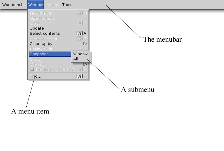
The menu system consists of the menu bar which shows the name of each menu, a drop-down menu under each name showing the list of choices (also known as menu items), and an optional group of secondary choices called a submenu, which are attached to a menu item. Submenus should appear to the right of the menu.
General Rules
Throughout your design of a menu system, keep the user in mind. Think of what the user will have to go through to choose a menu item. Working with a mouse is simple for simple tasks, but when menus get long or are complicated and illogically arranged, working with a mouse can be very frustrating indeed.
Strive for Fixed Menus
When possible, your menus should offer a fixed set of visible choices. A large, variable set of choices such as fonts can make a menu unwieldy.
Usually, a variable set of choices should be presented in either a requester or a scrolling list gadget. There are rare exceptions such as the standard User menu described later.
Multiple Selection
The user should be able to select a number of menu items at one time by clicking the multiple items with the selection button before releasing the menu button.
Anticipate conflicting choices that can occur during multiple selection. If the user chooses an item and then chooses one that conflicts with the first, the second item should override the first.
Let Intuition work for You
Many of the functions described here can be handled for you automatically through Intuition. Let Intuition do the work for you whenever possible rather than coding your own menus.
Menu Design
Use the same criteria for designing the menu system as for other elements of the GUI: design it on a 640x200 screen with the Topaz 8 font. At run-time, your application should test to see if the menu will fit in the user's preferred font and screen size. If not, revert to the Topaz 8 font.
Colors
When possible, menus should use dark text on a light background.
Font
A uniform font is recommended for all the menu items within an application. A change in font style could be appropriate, however, if it symbolizes a change in the style of text in your application. For example, in a word processor, a menu called Style may list the type styles Bold, Italic and Underline. Those menu items may be rendered in bold, italic and underline text, respectively.
Toggle Items
Some menu items turn an option on or off. To show this, use a check mark that toggles visible and invisible in a space in front of the item. Don't add a submenu with items such as "on" and "off".
Toggle items should be indented to allow room for the check mark. This will give the user a visual cue that it is a toggle item.

Organization
Within a menu, items should be grouped according to function. Distinct groups should be separated with a separator bar. "Function" can be defined by these three rules:
Separate the toggle items from the non-toggle items. This will help the user quickly distinguish one type from the other. It will also look better if the left-hand side of the menu text doesn't indent more than once.
Group similar choices together. For example, if a menu includes the items
- Save as ASCII
- Save as MystrEd doc
- Quit
- New
- Save as IFF clip
the three Save as... items should be grouped together.
Frequently used items should be placed towards the top of the menu. When ordering the items, make sure to separate commonly used items from dangerous ones. It's relatively easy for a user to choose the wrong menu item by mistake - try to anticipate such mistakes and their possible outcomes and arrange your menus to avoid them.
| Note |
|---|
| When ordering menu items, make sure to separate commonly used items from dangerous ones. |
Limit the Size
Try to limit the number of items in a menu to about a dozen. Submenus should have about a half dozen items at most. The utility of a menu decreases as its length increases.
On the Menu Bar
When it comes to ordering the menus themselves on the menu bar, remember that the user can most easily access the outside menus. Put menus that are used less towards the middle.
Follow the order given in Standard Menus for any standard menus.
Ghosting
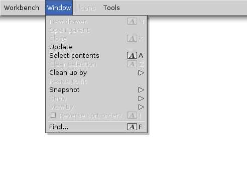
Whenever a menu or menu item is inappropriate or unavailable for selection, it should be ghosted. Never allow the user to select something that does nothing in response.
Labeling
Menu and menu items labels should be terse - preferably one to three words. Use the capitalization rules that apply in the language at hand.
Menu items that represent an action should reflect that action in the item's label. For instance, "Print" is better than "Printer". Try, also, to keep the terminology user-friendly and non-technical.
Don't repeat a menu's title on every item's label. For instance, in a Macros menu use the label "Load..." rather than "Load Macros...". Repeat the menu title, however, if user comprehension will suffer.
Toggle Items
As discussed earlier, indenting toggle items lets the user know that they represent a choice. Another cue you can give to the user is to end the label in a question mark. In some Settings menus, for example, an item labelled "Create Icons?" is preceded by a check mark (or placeholder) and ended with a question mark. Both are cues to the user that this is a toggle item.
Ellipsis
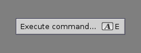
When a menu item brings up a window or requester, an ellipsis (three dots) should be appended to the menu item's label.
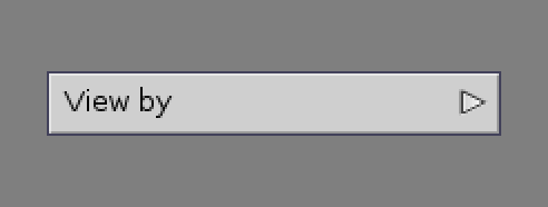
When an item has a submenu, the symbol » should be placed on the far right side of the menu item. These should be flush right (see the next section).
Lining up on the Right
If you have any symbols or text that you want to line up on the right side of the menu item, make sure it is flush right (ie. right justified) or it won't line up properly when used with a proportional font.
Standard Menus
Some menus and menu items appear so often in applications that their use and design can be standardized. Using standard menus will enhance the feeling of consistency across applications and help the user feel more comfortable with your program.
Listed below are standard menus that your application should use whenever appropriate. The order in which the menus and their items are presented is an important part of the specification.
Project Menu
Applications that create, edit and save data should have a Project menu. The Project menu should be the first menu on the left side of the menu bar and should contain as many of these items as appropriate - in the order shown.
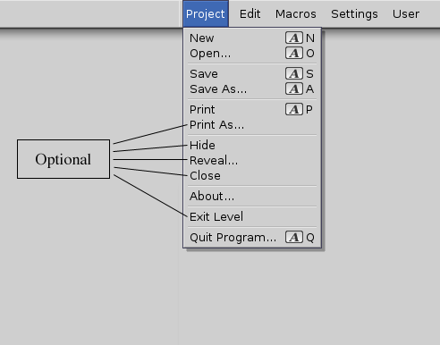
| Label | Shortcut | Description |
|---|---|---|
| New | Right-Amiga-N | New should open a blank, untitled project. |
| Open... | Right-Amiga-O | Open... should bring up a file requester. If an unsaved project currently exists, the modified project requester (Save project?) should be brought up when Open... is selected - unless your application supports multiple projects. |
| --- | ||
| Save | Right-Amiga-S | If the project had been saved previously, Save should copy the current version over the old version. If the project has never been saved, Save should bring up a file requester. |
| Save As... | Right-Amiga-A | Save As... should bring up a file requester to prompt the user for a name, and then save the file. |
| --- | ||
| Right-Amiga-P | Print should send the project to the printer using the current settings. The current settings may either be those found in Workbench's Prefs directory or individual program settings previously saved by the user. | |
| Print As... | Print As... brings up a requester that can be used to set your progam's print options. | |
| --- | ||
| Hide | This menu item is for programs that can handle multiple projects at one time. Hide should remove a project's window from the screen. If the user selects Quit Program before returning to a hidden project that has unsaved changes, the modified project requester should come up asking if he wants to save the project first. A separate modified project requester should be presented for each unsaved, hidden project. | |
| Reveal... | Reveal... is for programs that can handle multiple projects at one time. Reveal... should bring up a requester with a scrolling list gadget containing all opened projects whether hidden or not. Although its true purpose is to return hidden projects to the screen, it is more user-friendly to allow the user to view all open projects from this item. The chosen project's window should open an jump in fron of any other windows. If no projects are hidden, this item should be ghosted. | |
| Close | This menu item is for programs that can handle multiple projects at one time. Close should remove the current project's window from the screen. If there are unsaved changes, a modified project requester should come up first. | |
| --- | ||
| About... | About... should bring up a window with information about your program and the current project. What information is included is up to you, but it should include at least the version number of your software. Some suggested information to provide: ARexx port name, project size and tool name. | |
| --- | ||
| Exit [Level] | Exit [Level] should allow the user to leave the current level, such as the slide editing level in an electronic slide show program, and return to the next highest level. The word [Level] on the label can be replaced with the name of the current level. | |
| --- | ||
| Quit [Program]... | Right-Amiga-Q | Quit [Program]... should exit the entire program. The word [Program] can be replaced by the name of your application. A separate modified project requester should come up for any open or hidden projects with unsaved changes. Quit [Program]... should not be modal; i.e. it should be available at any level. |
Note:
- Print and Print As... are optional items for applications that support printing.
- Hide, Reveal... and Close... are optional items for multi-project applications. Exit is an option for multi-level programs.
Edit Menu
Any application that can perform editing functions should have the Edit menu in the second position. The following items represent the suggested list with Redo as an optional item. A basic rule is that any menu item that operates on blocks of data should go in the Edit menu.
You should support the Clipboard as your buffer for cut-and-paste operations. This will allow the user to share the clips between applications. For more information on the Clipboard see UI Style Guide Data Sharing.
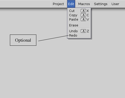
| Label | Shortcut | Description |
|---|---|---|
| Cut | Right-Amiga-X | Cut should remove the highlighted text or current object and place it in the buffer. |
| Copy | Right-Amiga-C | Copy should retain the highlighted text or current object in the project while also placing a duplicate of it in the buffer. The text should then be unhighlighted to show that the copy took place. |
| Paste | Right-Amiga-V | Paste should take whatever is in the buffer and place it at the insertion point in the project window. |
| --- | ||
| Erase | Erase should remove the highlighted text or current object. | |
| --- | ||
| Undo | Right-Amiga-Z | Undo should restore the project to the state it was in before the user's last action. If, for instance, the user imported a text clip by mistake in a word processor, Undo should automatically take it out. Some programs support multiple steps of Undo. Using the example in the previous paragraph, say the user had deleted a paragraph before inserting the text clip. Selecting Undo twice should take out the mistaken text clip and return his original paragraph. |
| Redo | Redo is an option for programs supporting multiple steps of Undo. In a program that doesn't support multiple steps of Undo, hitting Undo twice would take the user back to where he was before he selected Undo - it's cyclical. He imports a text clip, selects Undo and the text clip is gone. Select Undo again and the text clip is back again. In this program, Undo undoes Undo. But in applications with multiple steps of Undo, the user can undo anything except Undo. He just keeps going back another step instead of going through cyclical actions. So Redo is there to undo any mistaken Undos. | |
Macros Menu
If your application supports macros, it should use ARexx, the Amiga's built-in scripting language, rather than its own internal scripting language. For more information see UI Style Guide ARexx.
The Macros menu should allow the user to create and assign macros. Optionally, you can include the ability to load and save macros as well.
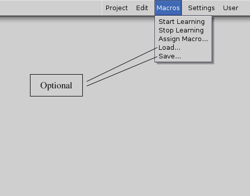
| Label | Shortcut | Description |
|---|---|---|
| Start Learning | When Start Learning is selected, all subsequent user actions should be written in ARexx script form to an internal buffer - until Stop Learning is selected. Feedback to the user is essential, so it would be a good idea to let the user know that the Start Learning command was accepted. The indicated can be subtle but should be noticeable if the user wants to look for it. One idea is to put a small glyph, letter or word in the project's title bar. | |
| Stop Learning | When Stop Learning is selected, your program should stop writing user actions to the internal buffer created by Start Learning. Any visual feedback that originated with Start Learning should go away. | |
| Assign Macro... | Assign Macro... should bring up a requester through which the user can assign the script created by the previous two commands. Macros can be implemented [in] a number of ways. One longtime favorite is to assign the macro to the function keys, the ten keys across the top of the keyboard, or to some other keyboard combination. Or the Macro can be assigned to the User menu (see section later in this chapter). Or the macro can be given a name and saved to disk; from there it can be implemented via an ARexx command console. Some programs may choose to support one, some or all of these methods. Your Assign Macro... requester should reflect all the possible choices your program supports. | |
| Load... | Load... should bring up a requester listing the macros that can be loaded into memory. This, along with Save..., forms an optional set of items. | |
| Save... | The macros design as discussed above assumes that key- and menu-activated macros will be assigned and used on a per-session basis. The next time the user returns to your program, the macros he had assigned to keys and menus will no longer exist. Save... should allow the user to name a macro and save it to disk. At another session, the macro could be loaded and then assigned to a key or menu. This, along with Load..., forms an optional set of items. Otherwise, if the user wishes to save the macros and their assigned positions, he should do it through the Save Settings item found in the Settings menu. |
Settings Menu
Provide a Settings menu if you allow the user to change and save aspects of your program's environment. This menu should be located in the second position from the right.
Consult UI Style Guide Preferences for more information about preferences in general.
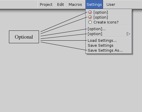
Two items should be accessible through this menu (if your program supports them): a toggle item asking if icons should be created and an overall Save Settings item. They may be directly in the menu or in a requester brought up by a menu item.
| Label | Shortcut | Description |
|---|---|---|
| [options] | Listed in this menu should be any specific options you wish to handle through a menu item, such as what screen resolution to operate in or baud rate for a terminal package. Or you could have an option labelled Set Settings... that would bring up a control panel which could be used to set all the program's options. [options] can be toggle items, or they can bring up submenus or requesters - it all depends on your application's needs. Whatever these options are, they would change the user's preferences for that session only. To save them as defaults the user would have to use one of the Save Settings items. Note: the word [option] shown here is only a placeholder to be replaced with a descriptive menu label. | |
| Create Icons? | Create Icons? is a toggle item that should allow the user to choose whether a .info file will be created with each project. A .info file contains a graphic image for the file's icon. User's who don't use the GUI as a filing system may find .info files to be extraneous and a waste of storage space. Your program should provide this menu item. | |
| --- | ||
| Load Settings... | Load Settings... is an optional item that should allow the user to change from his current settings to a new set of previously-saved settings. Load Settings... should be included if you think your users will want or need multiple settings files. | |
| Save Settings | Save Settings should save the user's settings as your application's default preferences. Each time your application is opened thereafter, it should use these user-specified settings. By default, Save Settings should save the new settings in the current settings file. See UI Style Guide Preferences for more information on saving settings files. | |
| Save Settings As... | Save Settings As... is an optional item that brings up a file requester. Save Settings As... will be used when the user wishes to save multiple settings files. There are a couple of reasons why this option may be helpful to users. A user may save different settings for different types of projects; e.g. settings.vid for projects being output to video and settings.prt for projects being output to a printer. Also, if your application is being used on a network, users may wish to save personal settings. | |
User Menu
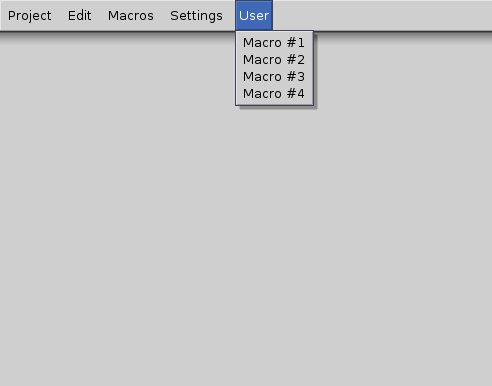
The User menu is a variable-length menu that contains user-defined macros and any other optional features a user may want to add as a menu item. This should be located at the far right.
