Copyright (c) Hyperion Entertainment and contributors.
UI Style Guide Workbench: Difference between revisions
Steven Solie (talk | contribs) |
Steven Solie (talk | contribs) |
||
| (3 intermediate revisions by the same user not shown) | |||
| Line 26: | Line 26: | ||
The AmigaOS is the only operating system that use two different images to display the state of the icon (normal and selected state) The selected image features a glow effect, which makes them easier to recognize. Both pictures are combined to an icon for a simple but most realistic looking animation. |
The AmigaOS is the only operating system that use two different images to display the state of the icon (normal and selected state) The selected image features a glow effect, which makes them easier to recognize. Both pictures are combined to an icon for a simple but most realistic looking animation. |
||
[[File: |
[[File:icon-two-states.gif|center]] |
||
==== Size ==== |
==== Size ==== |
||
| Line 32: | Line 32: | ||
The maximum size for an icon is 256 pixels wide by 256 pixels high. The icons will be scaled down to the desired size as adjusted in the Workbench Preferences. |
The maximum size for an icon is 256 pixels wide by 256 pixels high. The icons will be scaled down to the desired size as adjusted in the Workbench Preferences. |
||
[[File:icon-sizes.png |
[[File:icon-sizes.png|center]] |
||
The painting area of an icon is defied in three virtual sections: |
The painting area of an icon is defied in three virtual sections: |
||
| Line 95: | Line 95: | ||
The look of a project icon is usually determined by the application that created it and by the type of data it represents. However there is also a default project icon included in the system. |
The look of a project icon is usually determined by the application that created it and by the type of data it represents. However there is also a default project icon included in the system. |
||
==== Icon Families ==== |
|||
An icon family is a set of icons that use the same symbolism that makes is easier for the user to identify files that are associated with a program. An icon family usually consists of an icon for the drawer and the program itself, but additional icons for project, preferences, tools or even drives might be a good idea. |
|||
[[File:icon-families.png|frame|center|Example of an icon family: tool, drawer and project icon of AmiFIG]] |
|||
==== Create Icons? ==== |
==== Create Icons? ==== |
||
| Line 230: | Line 236: | ||
The window should activate when an icon is dragged into it. |
The window should activate when an icon is dragged into it. |
||
AppWindows |
AppWindows work whether the application is running on the Workbench screen or not. Users may also drag icons from another screen to the Workbench screen. |
||
As a general rule, AppWindows are appropriate when your application needs to have a window anyway. |
|||
==== AppIcons ==== |
==== AppIcons ==== |
||
Latest revision as of 18:16, 1 August 2013
Workbench
In a way, Workbench is just another program - but as the default interface on the Amiga, it's one program that many users will pass through on their way to your application. Although it has other facets and functions, it's the interface between your program and Workbench that is of concern in this chapter.
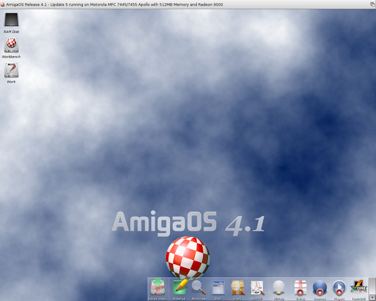
Icons
Icons are an important part of AmigaOS. Users like beautiful icons that describe a program in a clear and memorable way. Icons are pictorial representations of devices, directories, files, applications, objects or actions. Your program should have icons for anything the user can access including the main program itself, documentation files and any tools that may accompany the program.

The .info File
The icon imagery is found in a file bearing the suffix ".info". For example, the icon for a data file called "myletter" would be found, along with some other information, in the file "myletter.info".
Icon Design
A good icon quickly communicates the function it represents. The Workbench offers a photo-illustrative icon style - it approaches the realism of photography but uses the features of illustrations to convey a lot of information in a small space. An illustration provides much more flexibility for conveying a concept in a very small space and it also gives you necessary control over details, perspective, light and shadow, texture, and so on.
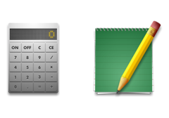
The Calculator icon and the NotePad icon are good examples.
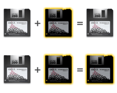
The AmigaOS is the only operating system that use two different images to display the state of the icon (normal and selected state) The selected image features a glow effect, which makes them easier to recognize. Both pictures are combined to an icon for a simple but most realistic looking animation.
Size
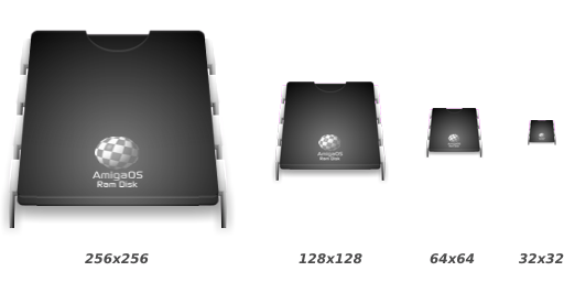
The maximum size for an icon is 256 pixels wide by 256 pixels high. The icons will be scaled down to the desired size as adjusted in the Workbench Preferences.
The painting area of an icon is defied in three virtual sections:
- The main icon area with a size of 200 x200 pixels for the illustration itself.
- The extra icon area with a size of 12 pixels on each side for the shadow, badges, signs and additional space for motion.
- The effect area with a size of 16 pixels on each side for the glow effect.
Look and Feel
The angles and shadows used for depicting various kinds of icons are intended to reflect how the objects would appear in reality. All icon elements have a common light source from in front above. The various perspectives are achieved by changing the position of an imaginary camera capturing the icon.
The AmigaOS style guide allows two general perspectives to display icons: icons look like they are placed on a workbench in front of you and icons that look like pined flat on the wall.
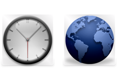
When the icon state is changed to select the light source will change extremely provide a glow effect. The colors of the icons will get darker (33 %) and a rich yellow shine will be added to the image to generate a great looking glow effect.
Color Palette
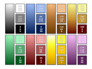
Color is a very important visual element of the AmigaOS icons as it has associated meanings and usually elicits emotional responses - to obtain it is very important to use color consistently.
AmigaOS icons use a basic harmonized RGB color palette and gradients based on these colors to generate a more realistic appearance. To achieve this goal, the colors need to work well together in many contexts.
Auxiliary Buttons
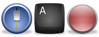
Icons for Preferences, Commodities and Dockies use buttons to separate them from other programs and make them easily distinguishable for the user.
Tips for Icon Design
Before you use words in an icon, think about how extensive a distribution you would like to see your product achieve. It's better to have an icon communicate through symbolism than language. Use global imagery that the user will easily recognize. Also avoid abstract or local symbolism and play on words. Keep your icons as simple as possible, fewer details might make your icons easier to distinguish in scaled down versions. Use the right perspective and colors for your icon. Avoid using the Boing Ball logo – the user usually knows on which system he is working.
Icon Types
There are five types of icons on the Workbench: disk icons, drawer icons, trashcan icons, tool icons and project icons.

Disk Icons
A disk icon represents a device for data storage. A double-click on a disk icon shows the content of the device in a filer
Drawer Icons
A drawer icon represents a directory of a device for data storage. A double-click on a drawer icon shows the content of the directory in a filer.
Trashcan Icons
A trashcan icon represents a temporary storage for files that have been deleted. A double-click on a trashcan icon shows the deleted files in a filer.
Tool Icons
A tool icon represents an executable file such as an application. A double-click on a tool icon will run the application. The look of tool icons varies from application to application.
Project Icons
A project icon represents a data file. Typically, a double-click on this icon will cause the application that created the data to run and automatically load this data.
The look of a project icon is usually determined by the application that created it and by the type of data it represents. However there is also a default project icon included in the system.
Icon Families
An icon family is a set of icons that use the same symbolism that makes is easier for the user to identify files that are associated with a program. An icon family usually consists of an icon for the drawer and the program itself, but additional icons for project, preferences, tools or even drives might be a good idea.

Create Icons?
When your application creates a data file, it should, by default, create a .info file to go with it. Many users are accustomed to accessing their projects via an icon.
Create the icon after the user successfully saves the project. This will prevent the possibility of project-less icons in the system.
Your application, however, should allow the user the option of saving files without creating icons. The recommended way of doing this is to have an item in the Settings menu called Create Icons?. This item should be enabled by default. See UI Style Guide Menus for more information.
Positioning
New project icons should never be saved in a specific position. Rather they should be positioned algorithmically by Workbench (see the Workbench flag NO_ICON_POSITION). In the same vein, if the imagery of an existing icon is changed (e.g. the application creates a reduced version of the project for use as the icon imagery) the icon should be saved without a specific position.
Argument Passing
To make the common operation of starting up programs more powerful, the Amiga provides ways of passing along more specific information to the application. This process of providing additional information to a program that's about to run is known as argument passing.
When using the Shell, the system is straightforward. The user runs an application by typing its name along with additional information such as the name of a file to operate on and any command options. The entire command line is then passed to the program as an argument.
The Workbench also provides means of passing arguments - but it is tied to icons instead of lines of type.
Tool Types and Default Tool
Applications started from Workbench receive startup information from the system in the form of a WBStartup message. The WBStartup message can be used to get various Workbench arguments including those found in the Tool Types and Default Tool fields of the icon the user clicked on.
Tool Types
If you click once on any tool icon and choose "Information..." from the Workbench's Icon menu, you should see a requester with a field for Tool Types.
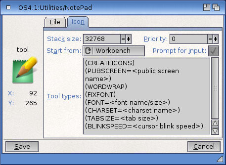
Arguments placed in this field take the form KEYWORD=value. KEYWORD is an argument name specified by your application, and value is a number or string that should be assigned to that argument.
For instance, the Tool Types field of a text display program might be set to LINES=20 to indicate how many lines to display at once.
Normally, the Tool Types information is filled in when the .info file is created; subsequent operations only read this information.
Default Tool
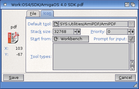
The Information requester for a project icon is different than that of a tool icon - it has both a Default Tool field and a Tool Types field. The Default Tool field tells the system which application is used to edit the project. When a user double-clicks on a project icon, the application specified in the Default Tool field gets run and the data is passed to that application via the WBStartup message.
Altering Icons
If your application needs to alter an icon for some reason, change only the things you intend to change and preserve the rest. If your application needs to change the Tool Types field, for instance, leave the imagery, position and Default Tool field alone.
More important, change only the Tool Types entries relevant to your application - do not rewrite Tool Types from scratch for an existing project. If the icon has a Tool Types entry that your application does not recognize, that entry should be preserved.
Tool Types and Networks
You should support project-specific Tool Types arguments. With the advent of networked Amigas sharing the same applications, this becomes increasingly important. Tool Types arguments written to specific projects will allow networked users to override Tool Types arguments written to the application's tool icon - arguments that have probably been set for the least common denominator.
Standard Tool Types Arguments
Some Tool Types arguments are already used in the system. If they apply to your application, support them; if not, take care that your Tool Types arguments don't conflict with these. Listed below are some of the more common Tool Types arguments found in the system:
| Note |
|---|
| Take care that your Tool Types arguments don't conflict with those listed here. |
| Tool Type | Notes |
|---|---|
| WINDOW=CON:<window spec> | |
| DONOTWAIT | Don't wait for return; used by wbstartup |
| TOOLPRI=<priority>
STARTPRI=<priority (-127 to 128) |
Used to set your program's priority |
| PUBSCREEN=<name> | The name of the public screen to open on |
| STARTUP=<name> | ARexx script to run at startup time |
| PORTNAME=<name> | Name to assign to your application's ARexx port; overrides default naming system |
| SETTINGS=<name> | Allows a user to specify a settings file |
| UNIT=<number> | Device or unit number |
| DEVICE=<parallel/serial> | The name of the device to use |
| FILE=<file pathname> | |
| WAIT=<number (of seconds)> | |
| PREFS=<prefstype> | |
| CX_POPUP=<yes/no> | |
| CX_POPKEY=<CX key specifier> | |
| CX_PRIORITY=<CX priority level> | |
| <CX fkey spec>=<CX string spec> |
The Apps
Other facilities also exist in Workbench that allow an application to get more information while the application is already running. These are known as AppWindow, AppIcon and AppMenu.
For example, a text editor's windows may function as AppWindows. A user would be able to drag the icon of a file into the window and that file would be loaded automatically.
AppWindows, AppIcons and AppMenus are aimed at the user. By using techniques that are totally graphic-oriented (Tool Types arguments still eventually come down to a line of type), the Apps bring the power of argument passing more into line with the "point-and-click" metaphor.
AppWindows
An AppWindow is a special kind of Workbench window that allows the user to drag icons into it. It's basically a graphical alternative to a file requester.
Applications that set up an AppWindow will receive a message from Workbench whenever the user moves an icon into that AppWindow. The message contains the name of the file or directory that the icon represents.
For instance, Workbench's IconEdit is an AppWindow with three different areas which users can drag icons into - each with a different purpose. When the user drags an icon into the large box, the icon is loaded as a project. When an icon is dragged into the box labelled "Normal", its image is used for the normal (not selected) image. Likewise for an icon that is dragged into the box labelled "Selected" - its image becomes the activated image for the icon.
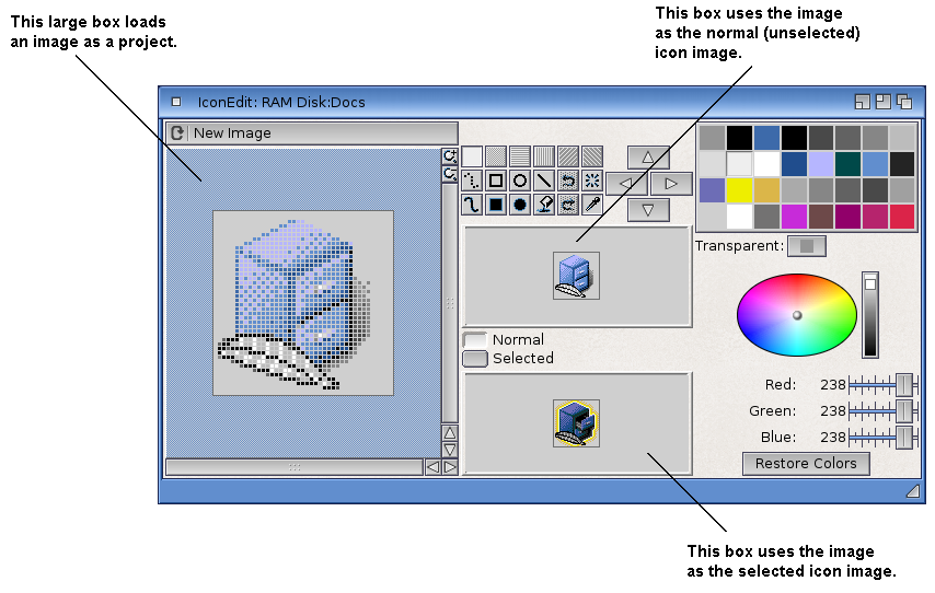
An AppWindow will often use icon drop box gadgets to indicate the active area where the user may drop an icon. Note: IconEdit did not follow this convention because it was more important to indicate the function of each area by its imagery (e.g. the "normal" area can be clicked on, etc.).
The window should activate when an icon is dragged into it.
AppWindows work whether the application is running on the Workbench screen or not. Users may also drag icons from another screen to the Workbench screen.
AppIcons
An AppIcon is similar an AppWindow - it allows the user to pass a graphical argument to a running application. The only difference is that AppWindows use a window to accept the argument and AppIcons use an icon.
The image for an AppIcon should give some indication what operations it supports; ie. whether it represents an iconized application or supports dropped projects. Avoid vague imagery.
AppIcons are useful for programs that operate in the background with little other user interaction - a print spooler is a good example.
Double-clicking on an AppIcon should normally open a window offering information and controls. For example, a print spooler could open a status window in which the user could rename, abort or re-order the things he sent to be printed.
AppMenus
An AppMenu allows your application to add a custom menu item to the Tools menu on Workbench. An application that sets up an AppMenu item will receive a message from Workbench whenever the user picks that item from the Workbench menu.
Preferences
Applications can also get arguments from Preferences. Via Preferences, the user can graphically set up the system defaults to suit his taste and needs.
Through Preferences, the user can control such things as screen fonts, colors and other global information that your application should respect.
You can create a preference editor to handle the defaults used by your application. See UI Style Guide Preferences for more information.