Copyright (c) Hyperion Entertainment and contributors.
UI Style Guide Gadgets
Gadgets are graphic symbols that represent a specific action or control. They are usually contained in a window or requester.
There are two basic types of gadgets on the Amiga: system gadgets and application gadgets
System Gadgets
System gadgets control aspects of the GUI environment like window size and screen positioning. System gadgets can be thought of basically as environment maintenance tools. This screen's in the way - click it to the back. This window needs to be bigger - click and drag on the sizing gadget.
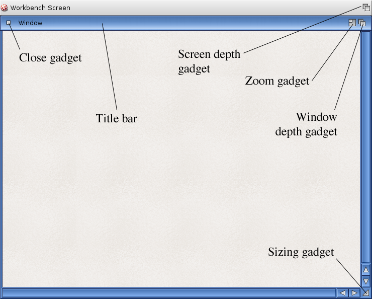
System gadgets are highly standardized in when and how they are used. Intuition will handle most of their functions. The table that follows lists the gadgets and how they operate. This is mainly for quick reference. Since the gadgets are tied closely to them, consult UI Style Guide Screens and UI Style Guide Windows and Requesters for more detailed information.
| Name | Description |
|---|---|
| Close | Located on a window's upper left corner, the close gadget removes the window from the screen and quits whatever program or file the window was running |
| Depth | Located on a window or screen's upper right corner, the depth gadget adjusts which window or screen is in front of all the others. For example, if a window is in front of all the other windows on that screen, clicking once on the depth gadget will put it behind all the other windows. Clicking again on that window's depth gadget will bring that window in front of all the other windows. |
| Sizing | Located on a window's lower right corner, the sizing gadget allows the user to resize the window by clicking on the gadget and dragging. Not all windows have or need a sizing gadget although its use and support is strongly encouraged. |
| Zoom | Located on windows next to the depth gadget, the zoom gadget allows users to quickly reduce a window to its minimum size to temporarily get it out of the way. When it is needed again, another click on the zoom gadget will bring the window back to the size it had been. Not all windows have or need a zoom gadget although its use and support is strongly encouraged. |
Note: This is only a reference listing of system gadgets. For more information about these see UI Style Guide Screens and UI Style Guide Windows and Requesters.
Application Gadgets
Application gadgets represent choices the user can make and thus proceed with his task. As a developer, you will have to make more decisions about how and when to use application gadgets than you will with system gadgets.
Design
Like other aspects of the GUI, gadget layout and size should be based on a 640x200 screen resolution with the Topaz 8 font. See @{"Resolutions" link Basi2} for more information.
At run-time, your application should check the size of the font and the screen resolution to determine if the gadgets used will fit in the window with the user's preferred settings. If not, revert to the Topaz 8 font.
Labeling
Put a label on gadgets whose purpose is not immediately obvious. Labels should be terse without being obscure - preferably one to three words. Ponder on these a while and test them if possible before incorporating them into your program. Capitalization should follow good grammatical sense for the language being used. If in doubt, refer to a writing or journalism style guide for your language. The Glossary in the back of this manual gives the English capitalization of many Amiga terms.
Ghosting
As with other elements of the GUI, a gadget that is temporarily unavailable for selection should be obviously disabled. Don't allow the user to select something that does nothing in response. Follow the ghosting standard shown in Ghosting.
Fig 5.2: A ghosted text gadget.
Keyboard Equivalents
As a convenience, a key may be bound to each gadget so that its actions can be controlled from the keyboard as well as through the mouse.
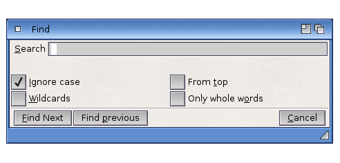
Use a logical letter from the gadget label as the key control for the gadget. For instance, a gadget labelled "Spacing" could use "S" as its keyboard control, whereas a gadget labelled "Get Fonts" may use "F". The letter you use should be underlined on the gadget.
Restrictions
Never provide keyboard equivalents for asynchronous requesters. An asynchronous requester is one that occurs due to an action of the application rather than an action of the user. In a hard disk backup program, for example, asynchronous requesters appear asking for a new floppy disk when the current disk is full.
Because asynchronous requesters can appear when the user isn't expecting them, keyboard equivalents can lead to the user choosing an unwanted action. Backup programs, to use that example again, don't require a lot of user attention, so there's a good chance the user will go to another application. If the backup program's requester comes up asking for a new floppy disk while the user is typing in a word processor, unwanted actions could easily occur.
An asynchronous requester will have two default however, that are built into the system. Left-Amiga-V and Left-Amiga-B will, respectively, activate the extreme left and extreme right gadgets at the bottom of a requester.
Another restriction on keyboard equivalents for gadgets: don't use the Return key to activate the OK gadget. This applies to both synchronous and asynchronous requesters.
| Left-Amiga-V and Left-Amiga-B will, respectively, activate the extreme left and extreme right gadgets in a requester. |
Visual Feedback
Visual feedback should be given when a keyboard equivalent is used. This feedback should be the same as the feedback given when the mouse is used. The specific feedback for each gadget is listed with the gadget description later in this chapter.
Grouping
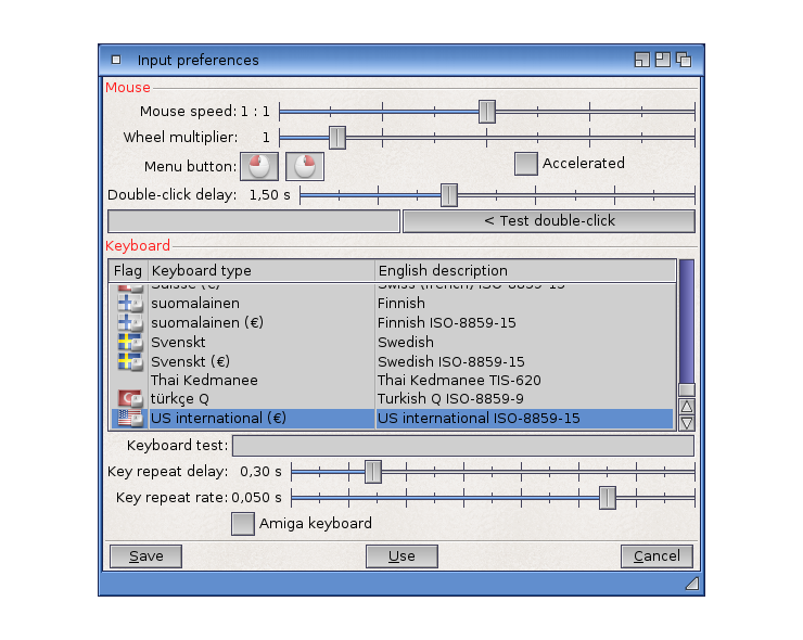
Gadgets should be grouped logically on your requesters or support windows. Some general premises about grouping follow. Use these premises and your own common sense when grouping elements.
The general rule is that gadgets should be grouped according to function. On a print requester, for example, gadgets controlling text would go in one area, while those affecting graphics would go in another.
Another rule is to place commonly used functions within easy reach, especially on a crowded control panel.
Don't put dangerous controls, such as Delete or Format, near commonly used controls.
Think of the user's work flow when you order the gadgets. Try to emulate a logical and intuitive order. If there is an order of events, start in the upper left and work to the lower right (depending on local language, of course).
Application Gadgets by Type
Each of the Amiga's application gadgets has a particular use and limitation. This section gives an overview of each type. Each type of gadget can be recognized by its appearance. Do not make gadgets that look like these standard gadgets but act differently.
Action Gadgets
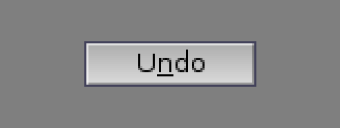
Action gadgets (often referred to as buttons) are graphic rectangles usually containing a few words. Clicking on an action gadget should perform the activity named on the action gadget.
Labels
Make the label descriptive. "OK" and "Cancel" may not always be the best choice. Use friendly, less technical terms (i.e. "Stop", rather than "Abort").
The user shouldn't have to read an entire body of text before deciding which action gadget to press. Instead, a carefully selected label should tell the user what the gadget does in one to three words.
Triggering the Action
The action should be triggered on the release of the mouse's select button - not the down press. This gives the user a chance to "roll off" the gadget before activating it.
More Choices
When an action gadget brings up another window or requester, the label should end in an ellipsis (three periods).

Use of Cancel
An action gadget labelled "Cancel" should only be used if it actually allows the user to back out, leaving the application exactly as it was before the requester appeared. For example, "Cancel" is not appropriate for a gadget on a requester that is displayed while printing is occurring. "Stop" would be a better label.
Gadget Placement
The positive choice, or continuation of the requested action, should be displayed on the lower left side of the requester/window, while the negative choice or discontinuation of the action should be displayed on the lower right.
Fig 5.7: The positive choice should be placed in the lower left, while the negative choice should go in the lower right corner.
Keystroke Activation
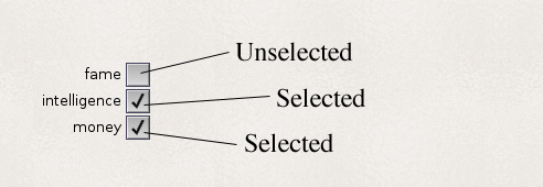
If activated through a keystroke, the state of the check mark should toggle within the box.
Scroll Gadget
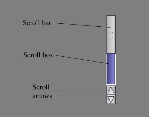
Scroll gadgets are used to adjust the position of a view. By themselves, scroll gadgets are used to adjust a large display area within a window's view, such as a text file that won't all fit within one window's view. Scroll gadgets are also a component of a scrolling list gadget (see next section).
A scroll gadget is comprised of the scroll bar, scroll box and scroll arrows.
Any window that displays only a portion of the file's entire contents should have scroll gadgets. If your application allows the editing of files that are wider than the window, it would be good to have a horizontal scroll gadget as well.
Moving Through in Steps
The display area should be updated immediately as the scroll bar is dragged.
When the user clicks in the scroll box (the rectangle containing the scroll bar) but not directly on the scroll bar, the display should move in viewfuls. For instance, if the user clicks in the scroll box above the scroll bar, the user's view of the list should move up so that the line which was first is now at the bottom of the view. The inverse applies where the user clicks below the scroll bar. This lets the user walk through the list in steps without missing anything on the list. Leaving one line from the previous view assures the user that he hasn't missed anything.
Scrolling List
A scrolling list features a view box showing textual names of files or objects accompanied by a scroll gadget to the right of the view box. If the list is longer than can be accommodated by the view box, the user can move through the list using the scroll gadget.
A scrolling list should be used whenever you need to present the user with a variable list of objects. Probably the most common example is found in the requester presented when a user chooses to open or save a file.
Fig 5.10: A scrolling list.
Custom Scrolling Gadgets
On the Amiga, only one of the items in the system-supplied scrolling list may be selected at a time. Using custom code, it is possible to create a scrolling list gadget that supports multiple selection. If implemented, that gadget should still follow the multiple selection guidelines for text covered in Highlighting Text.
Keystroke Activation
The scrolling list gadget reacts differently to shifted and unshifted keystrokes. An unshifted keystroke should cause the list to scroll forwards through the choices. A shifted keystroke should cause the list to scroll backwards through the choices.
Note: Using the Shift key in tandem with another key should never be the only way to do things since it is usually a choice that is not immediately apparent to the user. In the above case, it is backed up by the mouse.
Radio Buttons
Radio buttons are a group of mutually exclusive gadgets - one and no more than one is always selected. Use this when the user must choose one option from a short list of possibilities.
Fig 5.11: Radio buttons.
Radio buttons are similar to cycle gadgets in functionality. Each has its benefits and drawbacks. See later for a discussion on this subject.
Keystroke Activation
Radio buttons react differently to shifted and unshifted keystrokes. An unshifted keystroke should cause the highlighted button to cycle in one direction. A shifted keystroke should cause the highlighted button to cycle in the opposite direction.
Cycle Gadgets
Like radio buttons, cycle gadgets allow the user to choose one option from several but only the selected option is visible.
Fig 5.12: A cycle gadget.
Cycle gadgets should be used to set attributes, not trigger actions. Never use a cycle gadget for an on/off choice - use a check box instead.
Keystroke Activation
The cycle gadget reacts differently to shifted and unshifted keystrokes. An unshifted keystroke should cause the gadget to cycle forwards through the choices. A shifted keystroke should cause the gadget to cycle backwards through the choices.
Cycle Gadgets vs. Radio Buttons vs. Scrolling Lists
If the user needs to choose one option from a choice of three or more, cycle gadgets, radio buttons and scrolling lists are viable options. Which one you choose to implement depends on your application, your preference and common sense. Consider the following points:
- A cycle gadget presents a cleaner interface. The selected choice is quickly evident and the unwanted choices are hidden away. Theoretically it's also able to handle a larger number of choices, although users will probably have trouble remembering a really large number of choices. Large numbers of choices may work well in a cycle gadget if they are ordered choices, such as the months of the year.
- In general though, options with more than about a dozen choices should use a scrolling list.
- Radio buttons present a clear choice to the user - the possible choices are always visible. Radio buttons work well with a small number of options. They are probably also slightly more intuitive than cycle gadgets.
Color Selection Gadget
The color selection gadget (sometimes referred to as the palette gadget) allows the user to pick a color from a set palette.
Fig. 5.13: A color selection gadget.
Keystroke Activation
The color selection gadget reacts differently to shifted and unshifted keystrokes. An unshifted keystroke should cause the gadget to cycle forwards through the choices. A shifted keystroke should cause the gadget to cycle backwards through the choices.
Slider
Sliders are used to choose a value in a given range. Usually, this value represents a level or an intensity such as volume or color.
Sliders look similar to scrollers without arrows, but when the user clicks in the slider box above or below the slider bar, the slider value should change in single increments rather than entire views.
Fig 5.14: Slider gadgets.
Keystroke Activation
The slider reacts differently to shifted and unshifted keystrokes. An unshifted keystroke should cause the horizontal bar in the slider to move up. A shifted keystroke should cause the horizontal bar to move down. When the horizontal bar reaches either the top or bottom it should change directions automatically. Don't tie the direction solely to a shifted keystroke.
Text Gadget
Text gadgets (sometimes referred to as string gadgets) are rectangular boxes used to accept keyboard input for alphanumeric fields.
Fig 5.15: A text gadget.
Activating Text Gadgets
When a window or requester appears containing a text gadget, have the gadget immediately activated and ready for keyboard input if:
- there are no gadgets on the requester that can be activated by the keyboard;
- the window or requester appeared in direct response to user activity (i.e. it is not asynchronous).
If the window or requester has other gadgets that can be activated from the keyboard, the user should also be able to activate the text gadget from the keyboard. In this case, it should not be activated by default.
The user should not have to select the text gadget with the mouse before typing an entry (if he chose an action that directly called that requester up). If may seem like a small delay to go from keyboard to mouse to keyboard, but all breaks in the flow of your program should be minimized.
Ordering of Text Gadgets
When a window contains a series of text gadgets, activate the gadget in the far upper left region of the window first (depending on the scanning direction of the local language).
Moving Through Fields
Let the user move through fields with the Tab key. When the user presses Tab, activate the next text or number gadget in the series. When the user reaches the end of the series and presses Tab, the cursor should return to the first entry gadget. This function is supported by Intuition.
Shift-Tab should activate the previous gadget in the series.
| Let the user move through fields with the Tab key. |
Display Box
A display box is a rectangle that shows non-editable textual or numeric information.
Display boxes look similar to text gadgets, but since they are read-only, they appear recessed.
Fig 5.16: A display gadget.
Icon Drop Box
Icon drop boxes are used for manipulation of icons. If a user drags an icon to an icon drop box, the image of the icon is copied into the box. Depending on the function assigned to that icon drop box, the icon imagery may then be redrawn or used to represent other files.
Fig 5.17: An icon drop box.
Custom Gadgets
Sometimes a system-supported control does not provide the exact function you need. In that case, you may choose to create a custom gadget.
If a custom gadget is an extension to an existing gadget type, then you should try to emulate the features of the existing gadget.
For example, a custom multi-line text gadget should support the same keyboard functions that the standard single-line text gadget does. Right-Amiga-X should erase the text and Right-Amiga-Q should undo changes. Refer to Keyboard for more information on the keyboard conventions used in text gadgets.
All custom gadgets should support a minimum of three images: normal, selected and disabled. The gadget images must be usable on a monochrome screen.
Custom Icons
Custom icons are application-specific gadgets that can be moved and manipulated. The note object in a music package is one example.
Take care when using custom icons alongside action gadgets that have graphical labels. Since it is not clear which symbols trigger an action when clicked and which symbols move when clicked, users could be triggering unwanted actions. If you use both in the same application, be sure the user can tell at a glance which is which. Grouping them spatially is one possible solution. Color cues may provide a solution. Boxing them may be a third solution.